

As part of the curriculum of the Tu Delft master Design for Interaction, this project’s aim was to analyse the usability and user experience of an existing interface of a product, come up with a redesign for its user interface and evaluate it. And eventually, present a redesign for improvement.
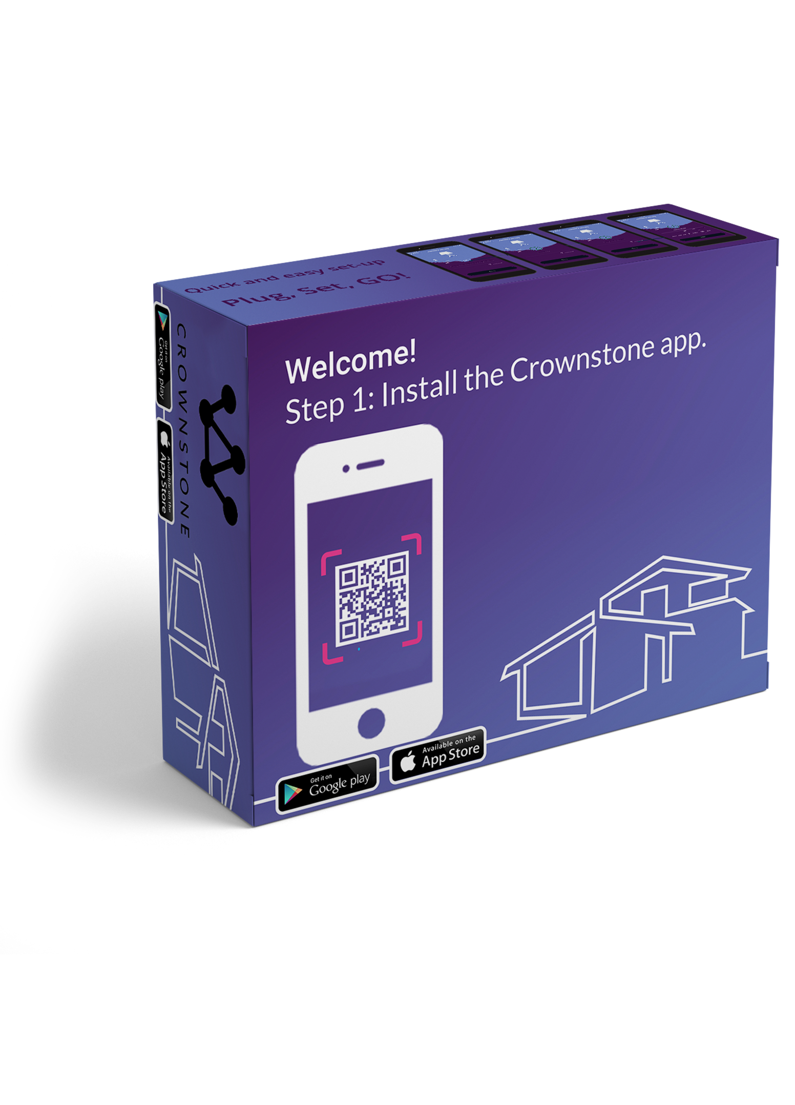
The client stakeholder is Crownstone, a start-up company that brought Crownstones to the market.
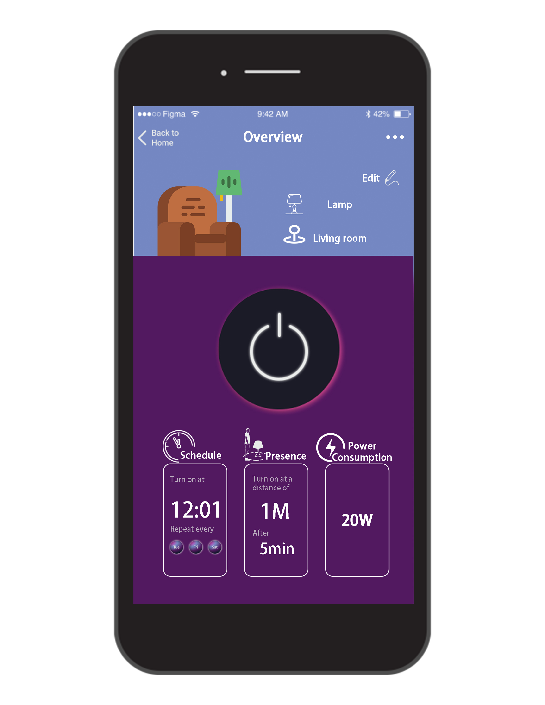
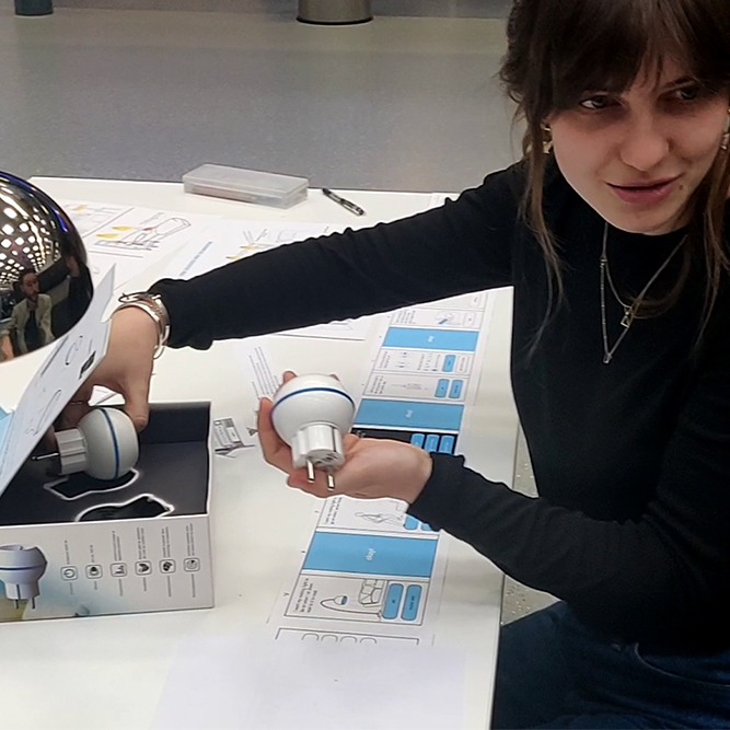
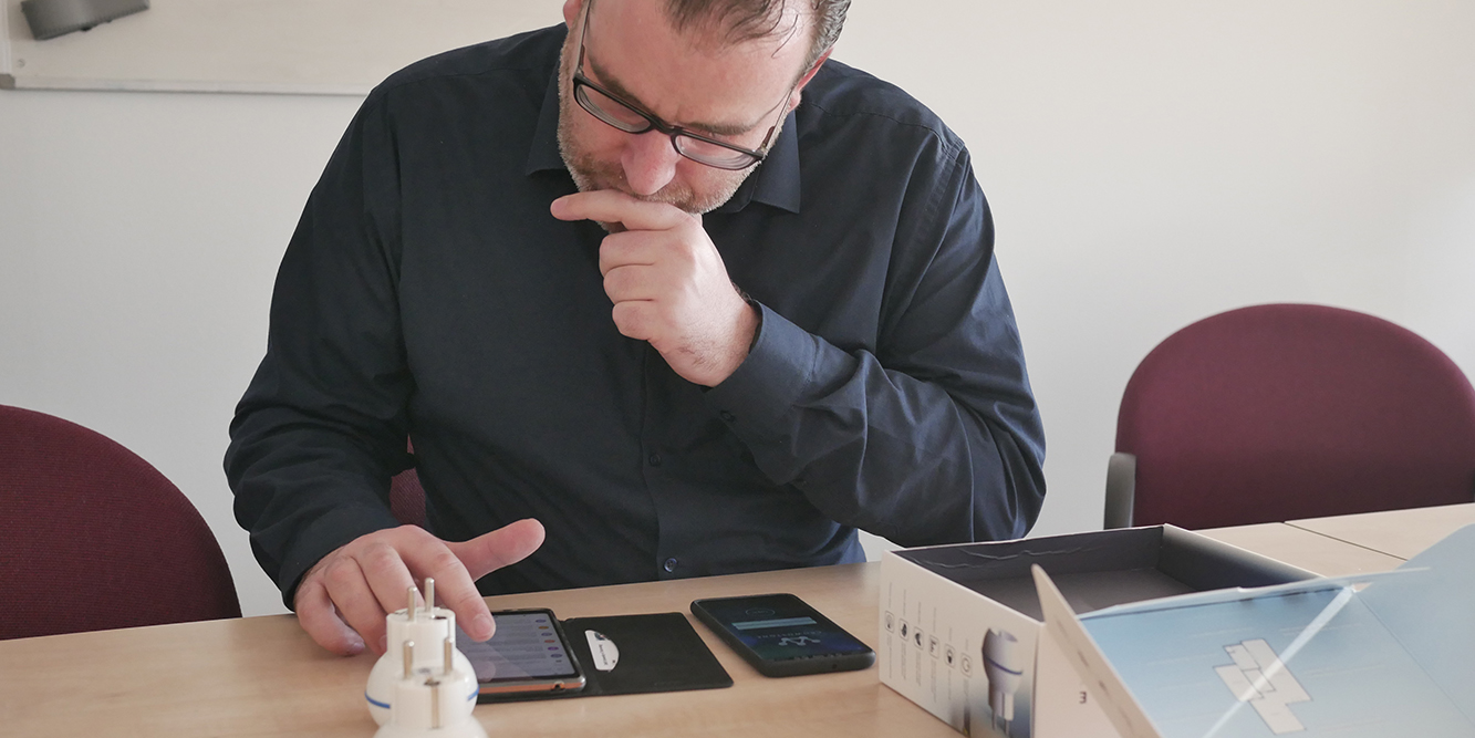
These smart plug sockets are plugged between the wall and any other device, allowing users to control the behavior of the socket by means of a mobile application.
Besides this, the system is also able to sense users’ presence and can switch the sockets accordingly. This allows the system to automatically turn on/off lights when users enter or leave a house, a room and so on.
By analysing the current application and use flow, we identified different issues regarding functionality, usability and experience. When receiving the Crownstones, users have to install and setup the system themselves.
In this setup and onboarding process, users suffer from a lack of guidance, making them frustrated and confused. They don’t understand the value and functionality of the Crownstone product, an information overload demotivates and confuses them.
Finally, the connection between the physical and application interactions are unclear.
To scope, we decided to focus on the improvement of the onboarding setup process in which the user should be instructed to the setup of the system and its use.
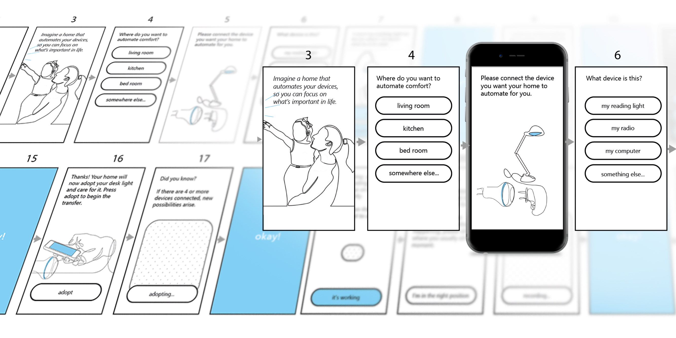
The process is focussed around different phases covering iterative cycles of usage evaluation and redesigns to make users feel intentional and confident while setting up the Crownstone system.
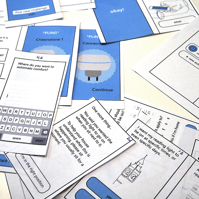
The first phase focused on analysing the current interface. By means of cognitive walkthroughs and usage inspections with prospected users, a number of issues were identified. A scope of the applications’ onboarding system setup process was chosen. To conclude the phase, a design brief is formulated to communicate insights and direction to the client.
This brief covered a design strategy proposal, a hierarchical list of testable requirements and their operationalised targets.
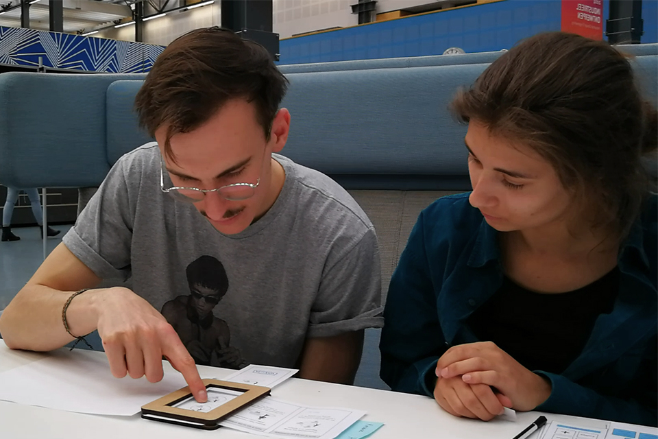
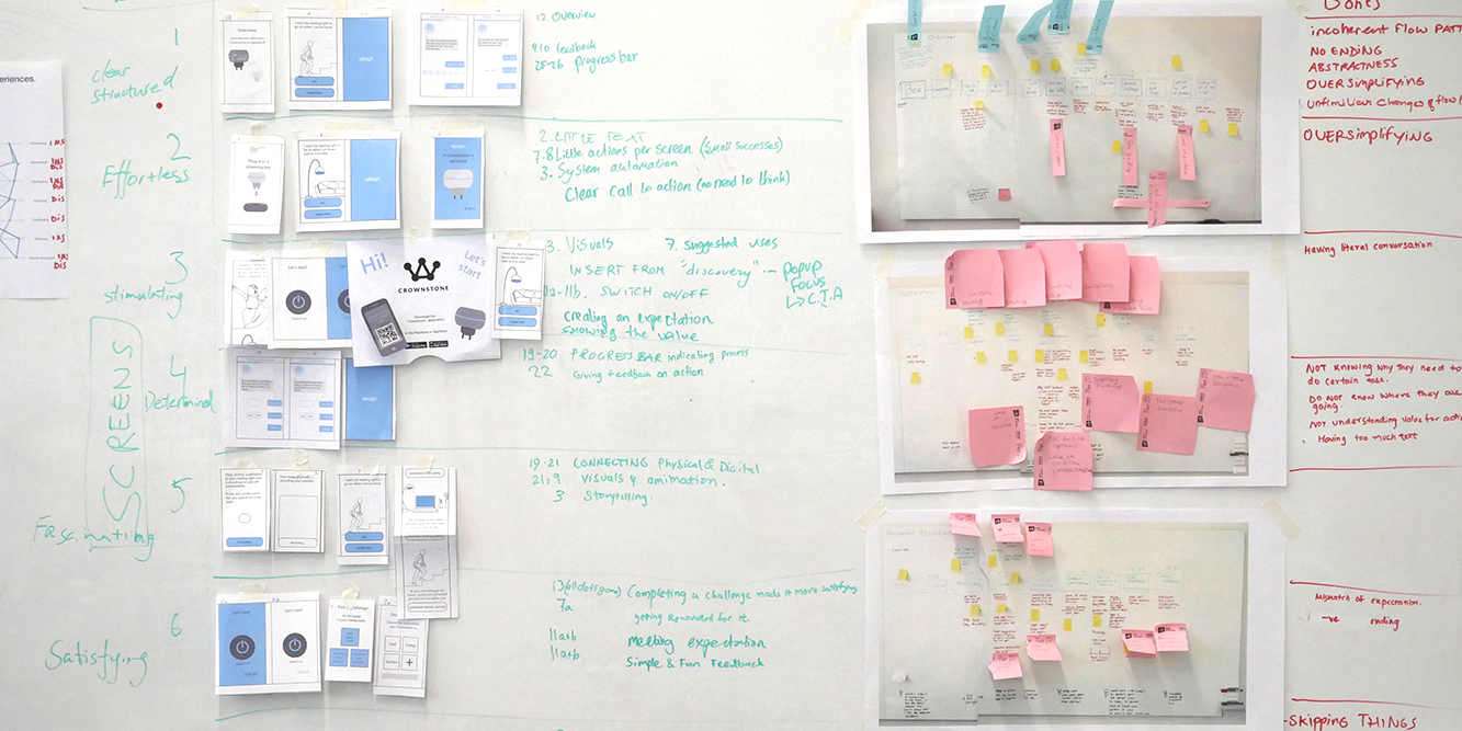
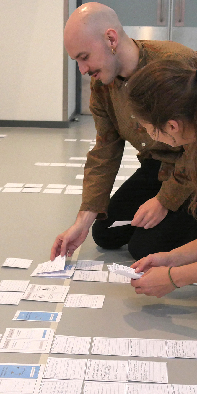
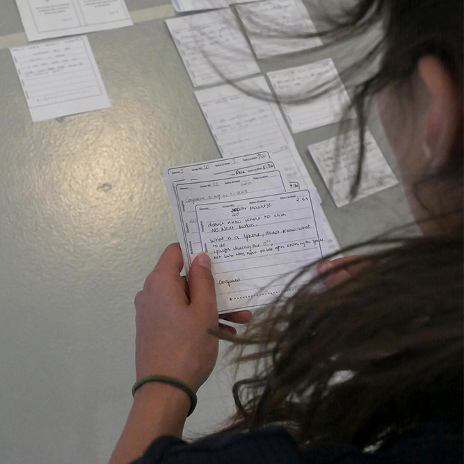
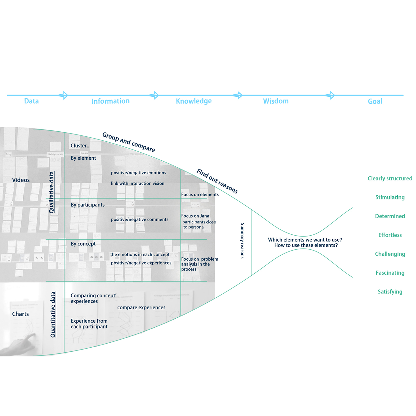
The second phase followed, in which three different design directions were conceptualised, each with a different use flow and suiting interactions. These were evaluated by mock-up interaction test to find out what elements fulfil our desired qualities of interaction.
Both qualitative as quantitative data was gathered and turned into information by clustering, then turned into knowledge by forming experience journeys and eventually turned into wisdom in the form of a proposed strategy of one conceptual redesign.
This process allowed us to come up with a redesign in that will make users feel intentional and confident while setting up the Crownstone system. This is achieved by quickly bringing the user into the process, then providing them with the tools to navigate through the application, and only starting to provide them with extra information when they are ready to take on more.
In the third phase this redesign was created and detailed in a clickable mock-up prototype in Figma and animated in Principle and evaluated by means of a cognitive walkthrough. Then a final refinement was done and again evaluated by means of a final test with our target users: homeowners seeking comfort, to find out if the design achieves its intended effect.
By Sara Schippers